

The Backstory
South East Asia, in two different countries. My partner and I were on a call, reminiscing about our recent trip to Bali. We then expressed how scary it was for dogs to randomly bark at us on the streets. When we asked locals, they revealed that many of the strays were left by their foreign owners who had made the decision to return home. And the majority of the dogs accompanied them to their Bali homes and remained there until they left the country.
Man's best friend left to fend for themselves when man decides to head home. Sad.
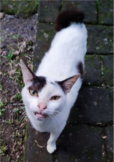
“Meow”, a cat named Luki interrupted my partner in the middle of our conversation. It frequently visited his villa in Bali to demand food to eat with its' 15-year-old teeth (or lack thereof). What if the locals wanted to spend some time with Luki, the elderly white cat with black patches, he wondered.
Luki the greedy elderly cat then served as our inspiration for the idea's inception. It gradually expanded to include a variety of canines for breeding and adoption.
We were on different islands when we made the decision to participate in the hackathon. With only 7 days left, we began our project with the creation of an online collaborative board where we could note ideas, features and plan our work.
After considering our six ideas, we chose to develop Luki, originally "Pets".
Luki is an online platform where users can adopt dogs, find mates for their dogs and even look for pet-sitters.
The Plan
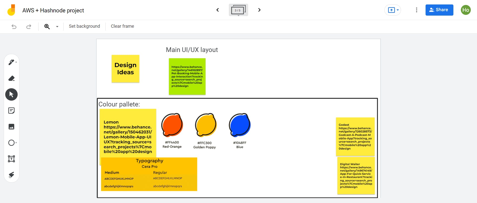
We first started the project off by looking for design inspirations on Behance. We settled on a basic layout and a very lemony colour palette.
During the design thinking phase, we decided to only implement the following pages:
- Homepage: Where you can see a list of all available dogs for adoption, breeding and dog sitters.
- Adoption page: A page where dogs are put up for adoption
- Breeding/Mating page: A page where owners can list their dogs up to find mates
- Sitters Page: A page where people can hire dog sitters
We then broke the pages down to the following components:
- Navbar

Main Page: Cards and Swipers

Adoption/Breeding/Sitters Page: Cards, Modals
In this blog, we’ll only go through how we made the above components.
The Execution
Data
First, we needed to draft some test data to be used for our front-end webapp. The following file was made:
Data.js
export const AdoptData = [
  {
    id: 1,
    name: "Abba",
    age: "15",
    img: Chihuahua,
  },
  {
    id: 2,
    name: "Cathy",
    age: "9",
    img: FrenchBullDog,
  },
  {
    id: 3,
    name: "Ethanol",
    age: "10",
    img: EnglishmixTibetanMastiff,
  },
  {
    id: 4,
    name: "Georgy",
    age: "9",
    img: Pomeranian,
  },
  {
    id: 5,
    name: "Ingrid",
    age: "8",
    img: Beagle,
  },
  {
    id: 6,
    name: "Kapn",
    age: "6",
    img: Dachshund,
  },
  {
    id: 7,
    name: "Milo",
    age: "4",
    img: GermanShepard,
  },
  {
    id: 8,
    name: "Opal",
    age: "2",
    img: GoldenRetriever,
  },
  {
    id: 9,
    name: "Queen Lizzy",
    age: "10",
    img: ChowChow,
  },
  {
    id: 10,
    name: "Sandi",
    age: "12",
    img: Dobermann,
  },
  {
    id: 11,
    name: "Lalu",
    age: "4",
    img: Dalmatian,
  },
  {
    id: 12,
    name: "Dolly",
    age: "4",
    img: Dalmatian1,
  },
];
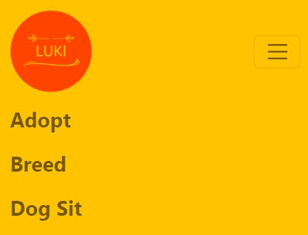
Navbar
We will mainly be using create-react-app and react-bootstrap for this project. You can install it by typing the following:
npx create-react-app luki-app
cd luki-app
npm i react-bootstrap bootstrap
We first import the following from react-bootstrap. This is also where you would want to import your navbar brand logo.
import Container from "react-bootstrap/Container";
import Navbar from "react-bootstrap/Navbar";
import Nav from "react-bootstrap/Nav";
import luki from "../luki1.png";
We then declare our Navigation Component with the NavBar element from react-bootstrap in the file Navbar.js
const Navigation=()=>{
  return(
   <Navbar>
      <Container>

      </Container>
    </Navbar>
  )
}
We can then place our navbar brand logo.
const Navigation=()=>{
  return(
   <Navbar>
      <Container>
         <Navbar.Brand href="/">
            <img
              alt="luki logo"
              src={luki}
              width="100"
              height="100"
              className="d-inline-block align-top"
            />
        </Navbar.Brand>
      </Container>
    </Navbar>
  )
}
Then we can add in our navigation links
const Navigation=()=>{
  return(
   <Navbar>
      <Container>
         <Navbar.Brand href="/">
            <img
              alt="luki logo"
              src={luki}
              width="100"
              height="100"
              className="d-inline-block align-top"
            />
        </Navbar.Brand>
        <Nav className="justify-content-end" style={{fontWeight: 700, fontSize: "25px"}}>
            <Nav.Link href="/adopt">Adopt</Nav.Link>
            <Nav.Link href="/breed">Breed</Nav.Link>
            <Nav.Link href="/sit">Dog Sit</Nav.Link>
        </Nav>
      </Container>
    </Navbar>
  )
}
To make the navbar responsive, we added in the toggle and collapse element from react-bootstrap
const Navigation=()=>{
  return(
   <Navbar>
      <Container>
         <Navbar.Brand href="/">
            <img
              alt="luki logo"
              src={luki}
              width="100"
              height="100"
              className="d-inline-block align-top"
            />
        </Navbar.Brand>
        <Navbar.Toggle aria-controls="responsive-navbar-nav"/>
        <Navbar.Collapse id="responsive-navbar-nav">
        <Nav className="justify-content-end" style={{fontWeight: 700, fontSize: "25px"}}>
            <Nav.Link href="/adopt">Adopt</Nav.Link>
            <Nav.Link href="/breed">Breed</Nav.Link>
            <Nav.Link href="/sit">Dog Sit</Nav.Link>
        </Nav>
      </Container>
    </Navbar>
  )
}
And we're done with the navbar! But notice that when the links are clicked, the url is changed however no page is rendered. That's because we haven't set up the routes and pages yet.
First, we create the following files under the Pages folder:
Home.js Adopt.js Breed.js Sitter.js
We will be using react-router-dom to handle our routing. It's installed by typing the following:
npm i react-router-dom
Next, in the index.js file, we import our pages and certain functions from react-router-dom. The functions that we will be needing are BrowserRouter, Routes(Previously Switch) and Route.
import React from "react";
import ReactDOM from "react-dom/client";
import "./index.css";
import App from "./App";
import "bootstrap/dist/css/bootstrap.min.css";
import reportWebVitals from "./reportWebVitals";
import { BrowserRouter as Router, Routes, Route } from "react-router-dom";
import Adopt from "./pages/Adopt";
import Breed from "./pages/Breed";
import Sitters from "./pages/Sitters";
import Home from "./pages/Home";
We then link the route and the elements
import React from "react";
import ReactDOM from "react-dom/client";
import "./index.css";
import App from "./App";
import "bootstrap/dist/css/bootstrap.min.css";
import reportWebVitals from "./reportWebVitals";
import { BrowserRouter as Router, Routes, Route } from "react-router-dom";
import Adopt from "./pages/Adopt";
import Breed from "./pages/Breed";
import Sitters from "./pages/Sitters";
import Home from "./pages/Home";

const root = ReactDOM.createRoot(document.getElementById("root"));
root.render(
  <React.StrictMode>
    <Router>
      <Routes>
        <Route path="/" element={<Home/>} />
        <Route path="/adopt" element={<Adopt/>} />
        <Route path="/breed" element={<Breed/>} />
        <Route path="/sit" element={<Sitters/>} />
      </Routes>
    </Router>
  </React.StrictMode>
);

// If you want to start measuring performance in your app, pass a function
// to log results (for example: reportWebVitals(console.log))
// or send to an analytics endpoint. Learn more: https://bit.ly/CRA-vitals
reportWebVitals();
Next, we created a layout wrapper to use in our pages. We put the navbar here so it'll appear in every page we create. We called this Layout.js.
import { Navigation } from "../src/components/Navbar";

const Layout = ({ children }) => {
  return (
    <div>
        <Navigation/>
        <div>{children}</div>
    </div>
  );
};

export default Layout;
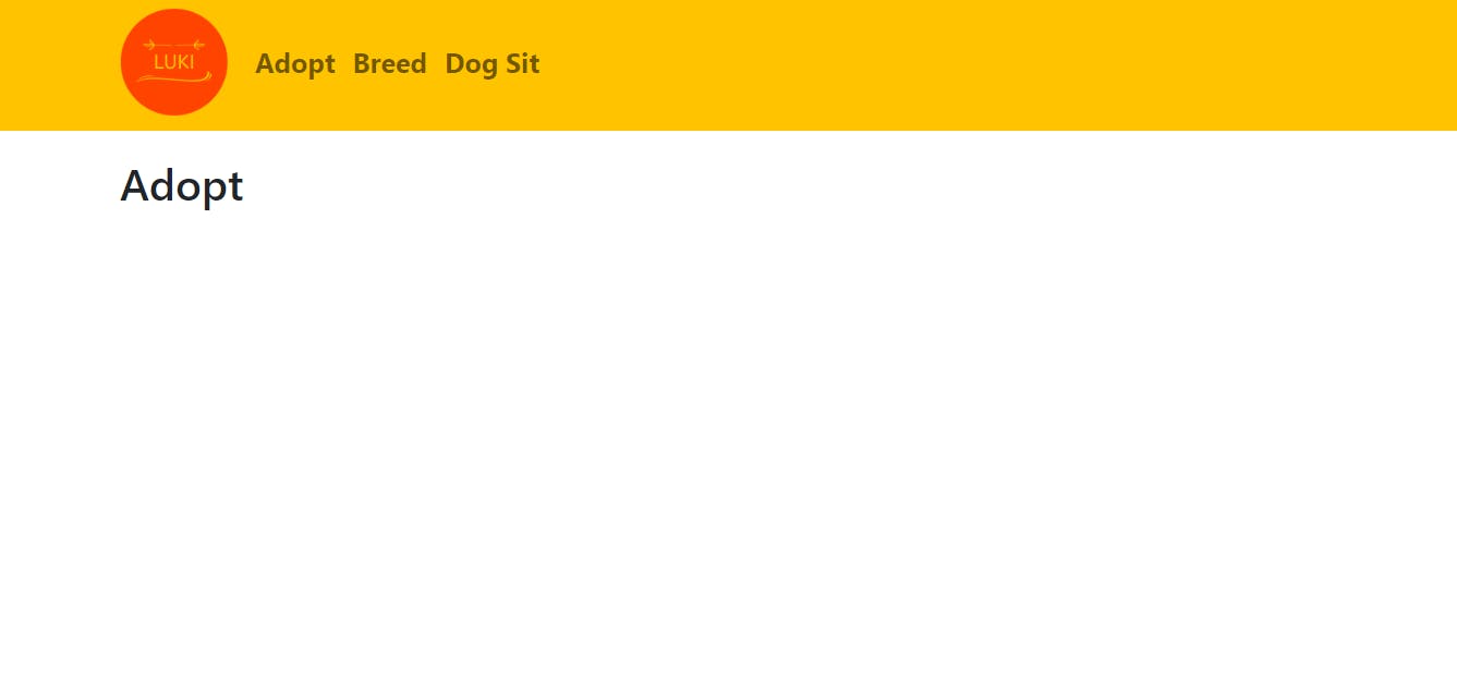
Now in the page Adopt.js, we can add the Layout.js wrapper in.
import React from "react";
import Layout from "../Layout";
import Container from "react-bootstrap/Container";

const Adopt =()=>{
    return(
            <Layout>
                <Container>
                    <h1 className="mt-4">Adopt</h1>
                </Container>
            </Layout>
    )
}

export default Adopt;
Now all there's left to do is to build the Card, the Modal and the homepage swiper. Lets move on to the card.
Card
We created a file named Card.js and allowed it to accept props.
import React from "react";
import Card from "react-bootstrap/Card";
import Button from "react-bootstrap/Button";

export const DesktopAdoptCard = ({ each }) => {
  return (
    <Card>
      <Card.Img className="card-img" variant="top" src={each.img} />
      <Card.Body className="d-flex flex-column">
        <h3>
          {each.name}, {each.age}
        </h3>
        <div className="d-grid" align="center">
          <Button onClick={onClick} className="align-self-end mt-auto">
            Adopt
          </Button>
        </div>
      </Card.Body>
    </Card>
  );
};
Then we can add in the stylings.
import React from "react";
import Card from "react-bootstrap/Card";
import Button from "react-bootstrap/Button";

export const DesktopAdoptCard = ({ each }) => {
  return (
    <Card
        style={{
            backgroundColor: "#FFC300",
            height: "330px",
            width: "300px",
            border: "2px solid #FFC300",
            borderRadius: "20px",
            color: "#FFF",
            boxShadow: "0 8px 8px -4px lightblue",
            padding: "20px",
            margin: "30px",
            marginBottom: "50px",
          }}

    >
      <Card.Img className="card-img" variant="top" src={each.img} />
      <Card.Body className="d-flex flex-column">
        <h3>
          {each.name}, {each.age}
        </h3>
        <div className="d-grid" align="center">
          <Button onClick={onclick} className="align-self-end mt-auto">
            {text}
          </Button>
        </div>
      </Card.Body>
    </Card>
  );
};
Then we add the following image style to index.css. This is to ensure every image is resized as evenly as possible.
.card-img{
  width: 100%;
  max-height: 25vh;
  object-fit: cover;
  border-radius: 15px;
}
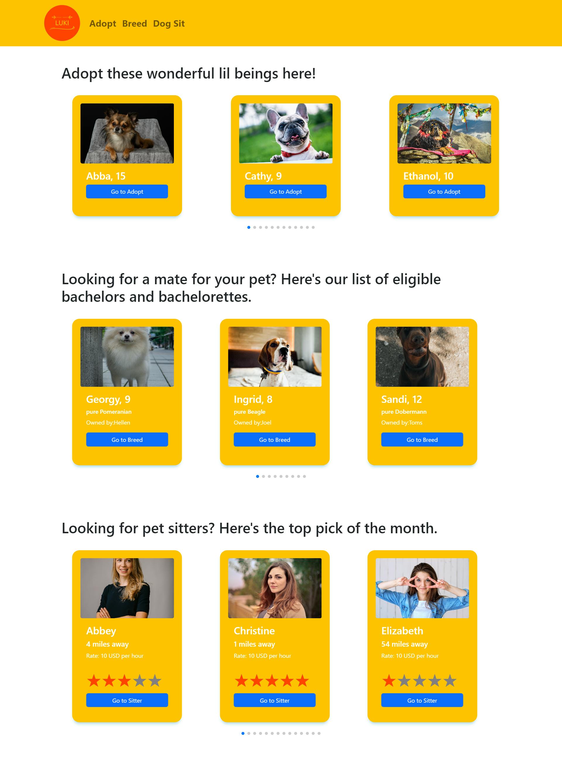
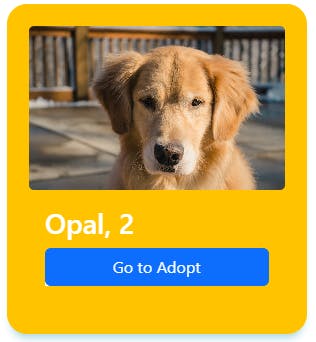 The card should look something like this but unpopulated.
Swiper
We can then use the card to make the swiper in the Homepage.js page. We used SwiperJS for that and to install it, we ran the following command:
npm i swiper
Then we created a file for the Swiper called AdoptSwiper.js.
import React from "react";
import { Swiper, SwiperSlide } from "swiper/react";
import { Pagination } from "swiper";
import "swiper/css";
import "swiper/css/pagination";

export const DesktopAdoptSwiper = () => {
  return (
    <Swiper
      spaceBetween={100}
      slidesPerView={3}
      loop={true}
      pagination={true}
      modules={[Pagination]}
    >

    </Swiper>
  );
};
We can then plug in our card component.
import React from "react";
import { Swiper, SwiperSlide } from "swiper/react";
import { Pagination } from "swiper";
import "swiper/css";
import "swiper/css/pagination";
import { DesktopAdoptCard } from "./Card.js";

export const DesktopAdoptSwiper = ({ petlist }) => {
  return (
    <Swiper
      spaceBetween={100}
      slidesPerView={3}
      loop={true}
      pagination={true}
      modules={[FreeMode, Pagination]}
    >
      {petlist.map((each) => (
        <SwiperSlide key={each.id}>
          <DesktopAdoptCard each={each} onClick={onClick} text={Go to Adopt}/>
        </SwiperSlide>
      ))}
    </Swiper>
  );
};
Now we can call our Swiper component in our homepage. We then created a page called Home.js.
import Layout from "../Layout";


const Home =()=>{
    return(
        <Layout>

        </Layout>
    )
}

export default Home;
Then, we plugged in our Swiper along with the test data we created earlier.
import Layout from "../Layout";
import Container from "react-bootstrap/esm/Container";
import { DesktopAdoptSwiper } from "../src/components/AdoptSwiper.js";
import { AdoptData } from "./Data.js"
const Home =()=>{
return(
<Layout>
<Container align="left">
<div className="p-5">
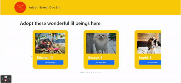
<h1>Adopt these wonderful lil beings here!</h1>
<DesktopAdoptSwiper petlist={AdoptData} />
</div>
</Container>
</Layout>
)
}
export default Home;
Our goal now is to redirect the webapp to the Adopt.js page when we click on the card button. To do so, we will be using the useNavigate component from react-router-dom (which we have already installed earlier on). We then build onto the code from AdoptSwiper.js.
import React from "react";
import { Swiper, SwiperSlide } from "swiper/react";
import { Pagination } from "swiper";
import "swiper/css";
import "swiper/css/pagination";
import { DesktopAdoptCard } from "./Card.js";
import {useNavigate} from "react-router-dom";

export const DesktopAdoptSwiper = ({ petlist }) => {
 const navigate = useNavigate();

  const navigateAdopt=()=>{
    navigate('/adopt');
  }

  return (
    <Swiper
      spaceBetween={100}
      slidesPerView={3}
      loop={true}
      pagination={true}
      modules={[FreeMode, Pagination]}
    >
      {petlist.map((each) => (
        <SwiperSlide key={each.id}>
          <DesktopAdoptCard each={each} onClick={navigateAdopt} text={Go to Adopt}/>
        </SwiperSlide>
      ))}
    </Swiper>
  );
};
Now the homepage Swiper is complete! Clicking on the Card button in the homepage swiper should redirect us to the Adopt.js page. Thus, we can populate the Adopt.js page with the cards and appropriate data.
import React from "react";
import Layout from "../Layout";
import Container from "react-bootstrap/Container";
import Row from "react-bootstrap/Row";
import { AdoptData } from "../Data";
import { DesktopAdoptCard } from "../components/Card";


const Adopt =()=>{
    return(
            <Layout>
                <Container>
                    <h1 className="mt-4">Adopt</h1>
                    <Row className="justify-content-center">
                        {AdoptData.map((each, id)=>(
                            <DesktopAdoptCard each={each} onClick={onClick} text={Adopt} />
                         ))}
                    </Row>
                </Container>
            </Layout>
    )
}

export default Adopt;
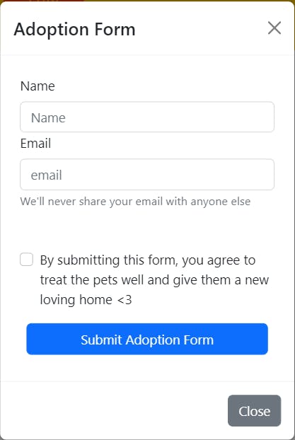
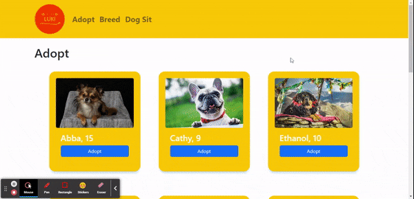 Great! We've populated our Adopt.js page. Now lets build an adoption form within a modal for users to submit.
Modal
We will be using Formik and Yup for this step. Run the following command in-order to install them.
npm i formik
npm i yup
After that we then created a file called Modal.js and import the following:
import React, from "react";
import Modal from "react-bootstrap/Modal";
import Button from "react-bootstrap/Button";
import Stack from "react-bootstrap/Stack";
import Form from "react-bootstrap/Form";
import { useFormik } from "formik";
import * as Yup from 'yup';


export const AdoptModal = () => {
  return (
  );
};
First, we build the modal like so.
import React, from "react";
import Modal from "react-bootstrap/Modal";
import Button from "react-bootstrap/Button";
import Stack from "react-bootstrap/Stack";
import Form from "react-bootstrap/Form";
import { useFormik } from "formik";
import * as Yup from 'yup';


export const AdoptModal = ({ show, onHide }) => {
  return (
    <Modal
      show={show}
      onHide={onHide}
      backdrop="static"
      keyboard={false}
      size="lg"
      centered
    >
      <Modal.Header closeButton>
        <Modal.Title>Adoption Form</Modal.Title>
      </Modal.Header>
      <Modal.Body>

      </Modal.Body>
      <Modal.Footer>
        <Button variant="secondary" onClick={onHide}>
          Close
        </Button>
      </Modal.Footer>
    </Modal>
  );
};
Then, we set up Formik and Yup to be used for validation
import React, from "react";
import Modal from "react-bootstrap/Modal";
import Button from "react-bootstrap/Button";
import Stack from "react-bootstrap/Stack";
import Form from "react-bootstrap/Form";
import { useFormik } from "formik";
import * as Yup from 'yup';


export const AdoptModal = ({ show, onHide }) => {
 const formik = useFormik({
    initialValues: {
      name: "",
      email: "",
      terms: "",
    },
    validationSchema: Yup.object({
        name: Yup.string().required("Name is required."),
        email: Yup.string().email("Email is invalid").required("Email is required."),
        terms: Yup.bool().required("Adoption Terms must be accepted"),
    }),
    onSubmit: (values) => {
      alert(JSON.stringify(values, null, 2));
    },
  });
  return (
    <Modal
      show={show}
      onHide={onHide}
      backdrop="static"
      keyboard={false}
      size="lg"
      centered
    >
      <Modal.Header closeButton>
        <Modal.Title>Adoption Form</Modal.Title>
      </Modal.Header>
      <Modal.Body>

      </Modal.Body>
      <Modal.Footer>
        <Button variant="secondary" onClick={onHide}>
          Close
        </Button>
      </Modal.Footer>
    </Modal>
  );
};
Then we build the form within the modal body tag.
import React, from "react";
import Modal from "react-bootstrap/Modal";
import Button from "react-bootstrap/Button";
import Stack from "react-bootstrap/Stack";
import Form from "react-bootstrap/Form";
import { useFormik } from "formik";
import * as Yup from 'yup';


export const AdoptModal = ({ show, onHide }) => {
  const formik = useFormik({
    initialValues: {
      name: "",
      email: "",
      terms: "",
    },
    validationSchema: Yup.object({
        name: Yup.string().required("Name is required."),
        email: Yup.string().email("Email is invalid").required("Email is required."),
        terms: Yup.bool().required("Adoption Terms must be accepted"),
    }),
    onSubmit: (values) => {
      alert(JSON.stringify(values, null, 2));
    },
  });
  return (
    <Modal
      show={show}
      onHide={onHide}
      backdrop="static"
      keyboard={false}
      size="lg"
      centered
    >
      <Modal.Header closeButton>
        <Modal.Title>Adoption Form</Modal.Title>
      </Modal.Header>
      <Modal.Body>
        <Stack gap={2} direction="vertical" className="col-md mx-auto p-2">
          <Form onSubmit={formik.handleSubmit}>
            <Form.Group>
              <Form.Label htmlFor="name">Name</Form.Label>
              <Form.Control
                id="name"
                name="name"
                placeholder="Name"
                onChange={formik.handleChange}
                onBlur={formik.handleBlur}
                value={formik.values.name}
              />
              {formik.touched.name && formik.errors.name ?
              <div className="text-danger">{formik.errors.name}</div>
              : null }
            </Form.Group>

            <Form.Group>
              <Form.Label htmlFor="email">Email</Form.Label>
              <Form.Control
                id="email"
                name="email"
                type="email"
                placeholder="email"
                onChange={formik.handleChange} onBlur={formik.handleBlur}
                value={formik.values.email}
              />
              <Form.Text className="text-muted">
                We'll never share your email with anyone else
              </Form.Text>
              {formik.touched.email && formik.errors.email ?
              <div className="text-danger">{formik.errors.email}</div>
              : null }
            </Form.Group>
            <Form.Group className="pt-5">
              <Form.Check
              id="terms"
              name="terms"
                onChange={formik.handleChange}
                onBlur={formik.handleBlur}
                value={formik.values.terms}
                type="checkbox"
                label="By submitting this form, you agree to treat the pets well and give them a new loving home <3"
              />
               {formik.errors.terms &&
              (<div className="text-danger">{formik.errors.terms}</div>)
              }
            </Form.Group>
            <div className="d-grid p-2 pt-3" align="center">
              <Button type="submit">Submit Adoption Form</Button>
            </div>
          </Form>
        </Stack>
      </Modal.Body>
      <Modal.Footer>
        <Button variant="secondary" onClick={onHide}>
          Close
        </Button>
      </Modal.Footer>
    </Modal>
  );
};
And the modal is done! Now all we have to do is connect it to the cards on the Adopt.js page like so and implement the states and setStates to be passed down.
import React, {useState} from "react";
import Layout from "../Layout";
import Container from "react-bootstrap/Container";
import Row from "react-bootstrap/Row";
import { AdoptData } from "../Data";
import { DesktopAdoptCard } from "../components/Card";
import { AdoptModal } from "../components/Modal";


const Adopt =()=>{
    const [openModal, setOpenModal] = useState(false);
    const handleClose=()=> setOpenModal(false);
    const handleOpen=()=> setOpenModal(true);

    return(
            <Layout>
                <Container>
                    <h1 className="mt-4">Adopt</h1>
                    <AdoptModal show={openModal} onHide={handleClose} />
                    <Row className="justify-content-center">
                        {AdoptData.map((each, id)=>(
                            <DesktopAdoptCard each={each} onClick={onClick} text={Adopt} />
                         ))}
                    </Row>
                </Container>
            </Layout>
    )
}

export default Adopt;
 And we're done with the Adopt.js page! We repeated the steps with slight variations for the Breed.js and the Sitters.js page.
After all the pages are set up, we pushed our code to Git and used AWS Amplify to host our web app. Initially, our images weren't showing up after deployment. We soon found out that it was because we used jpeg and the jpeg file extension is not originally included in the regex of the rewrite file for SPAs.
To fix the issue, we just have to add |jpeg| into the source address.
Steps to reproduce:
- Go to your AWS console and select your app.
- Click on Rewrites and redirects
- Select Edit
- Replace the source address with
</^[^.]+$|\.(?!(css|gif|ico|jpg|jpeg|js|png|txt|svg|woff|ttf|map|json)$)([^.]+$)/> - Save and refresh your hosted page.
And we're done!